MARJORIE VERLIN

This plan view shows a bedroom on the third floor of a three story multi-use apartment building. A queen sized bed (Tempurpedic mattress, KD natural poplar bed frame) is positioned in the center of the room and sits opposite a counter height table (Room & Board) with a TV (Hisense) and antique desk. Two Oldcastle windows (1’10” x 6’10”) with drop down hinged openings (20”) flank either side of the tables. To the left of the enterance is an oak dresser and a pocket door (3’) that leads to a master bathroom. The far side of the room is comprised of a floor to ceiling window (Oldcastle, 3’6” x 9’) with a drop down hinged opening (26”) and a sliding glass door (Oldcastle, 6’ x 6’10”).

This elevation view shows the counter height table and desk opposite the bed. The Oldcastle windows are more easily visualized in this view, along with the hinged openings at the bottom. This space utliizes exposed duct work (ATCO, 10” and 6” galvanized steel,
0.013
“ thick, in accordance with Michigan Building code M1601.1.1) A wide barrel chair from Wayfair.com sits on the far end of the room. The ceilings are 9’, in accordance with Ann Arbor Building code 8:503 which states that ceiling height must exceed 7’.

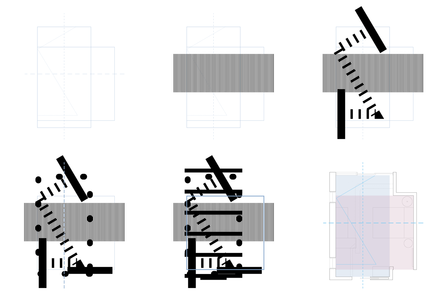
This organizational diagram highlights the two main shapes that form the boundary of the space as well as other foundational relationships in the room. The horizontal dashed line depicts the symmetry created by the bed and side tables, the vertical dashed line indicates a main circulation path, and the zig-zag line marks the points of entry for natural light.

The linework from the organizational diagram is transformed into an abstract graphic composition, as can be seen in this sequence. The marker of symmetry becomes a long, skinny stripe in the background. In contrast, the circulation path takes on a bold, wide stripe. The zig-zag line cuts through the composition in a series of medium sized stripes with an oversized “T” on both ends. The square area in the front of the room takes on bold rounded corners and medium thick stripes, interlocking with the other elements to create a gridded effect. The elongated rectangular shape transforms into a series of ovals and is also terminated with an oversized rectangular “T”.

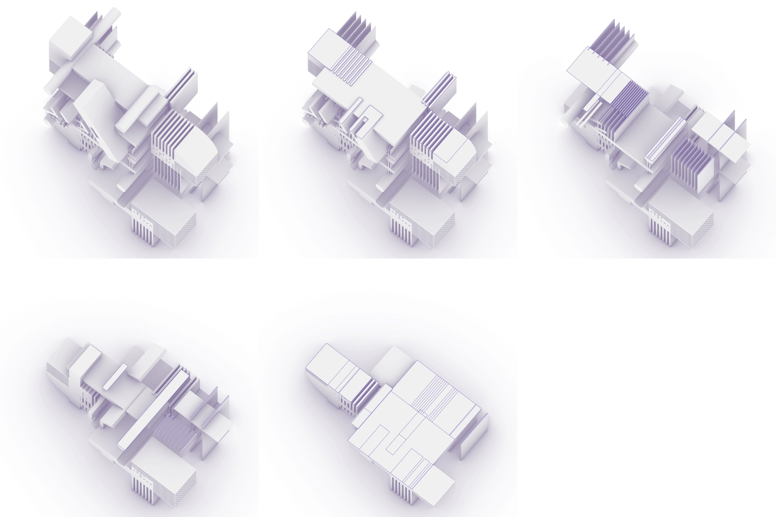
Nearly unrecognizable, this plan view shows the composition after a dimensional transformation. The shapes have been extruded to three heights (8’, 10’, and 11’) and staggered to create an interlocking grid. The plan has been rotated 90 degrees, as visualized best in elevation view. The ovals from the rectangle in the original diagram have become long cylindrical forms, as can be seen on the bottom mid-right corner.

This top down view highlights how the bold horizontal lines created by the circulation path work to create a framework on which other components build. It also shows how the elements interact with the grid. Created by the bold square line, the grid is repeatedly formed and splintered throughout the space.

The rotation of the plan and subsequent creation of vertical space is displayed in this perspective view. The basic order of the plan has been retained, with an exphasis placed on gridded elements and intersections. A dynamic focal point is found as the zig-zag line cuts through the rectilinear space to meet the oversized endcap “T” at the top.