EVAN WEINMAN

My bedroom shows a room in transition. The room, which is typically used as an office, is packed full of boxes, duffel bags, tote bags, and backpacks--a variety of containers which hold my belongings. The room itself is a different kind of container that provides space for not only the storage of person items, but also for the storage of self. The room is where I putmyself to sleep or to work, and is a place of personal privacy that contains most of the basic requirements for my daily life. Specifically, my airmattres provides a place to sleep and regenerate, the desk a place to work and interact with the world from behind the veil of a computer. Shelving provides storage for book and miscelaneous items, while duffel bags and boxes enable me to store items that are not immediatley needed.

This elevation show the human services side of the room. Along this wall is where I spend most of my time either sleeping or working. Moreover, this elevation shows several piles of boxes, a bookshelf, pictures, paintings, and the printer. These components work together to paint a picture that shows how I use the room and how the uses are organized adjacent to one another. The decorative objects hanging along the walls, while simple ornaments, contain images of home and of family that embed an emotional value to the space beyond its simple service to me and even though the room is in transition, it is a comfortable space to inhabit.
>
There are two Actor-network Theory maps shown side by side to explore two ways in which a Life Cycle Analysis might be further expanded upon to better highlight the human impact at various stages of product production. The first map was created to investigate the multitude of actors and processes that affect the Life Cycle Analysis for an Osprey brand back pack. As a cradle-to-grave product, the analysis is organized sequentially from the processing of raw materials to the eventual end of life for the pack.
Comparatively,the second map was created for a Cycle Dog dog collar, a product that is made out of 100% recycled materials that have been re-processed and are currently being re-used for a new use. This map is organized in a spiral shape with the center point representing the point of origin where the materials were initially extracted. As the spiral moves outward, these initial materials are processed, used, and re-processed into a new product for a new life cycle.
Comparatively,the second map was created for a Cycle Dog dog collar, a product that is made out of 100% recycled materials that have been re-processed and are currently being re-used for a new use. This map is organized in a spiral shape with the center point representing the point of origin where the materials were initially extracted. As the spiral moves outward, these initial materials are processed, used, and re-processed into a new product for a new life cycle.

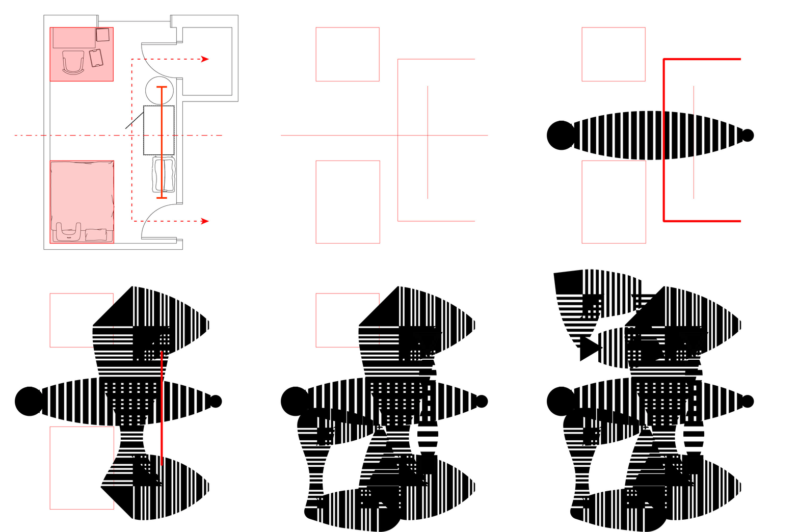
The organizaitional diagram above explains the most basic use strategies of my bedroom--the two primary zones of inhabitance, the main circulatory thruway, a cluster of objects, and the main axis of symmetry. These “rules” of my space also help explain my relationship with the space. Each element of the diagram was chosen because they are critical components of my interaction with the space--these are the components of which I am most aware. Through understanding the relationships of these components to eachother and to unnamed spatial relationships, an outside observer might better understand my current experience of domestic life.

Not depicted in the previous organizational digaram is a quality of the space that is difficult to distill: clutter. This characteristic is instead captured by transforming the once continuous lines into a series of wide dashed lines that overlap and intersect similarly to the random mess of objects in my room. The overall effect is a dissordered conglomerate of lines that belong to a larger organizational strategy.

The roof plan shows the massing strategy of the final model. The design, which reads as a single continuous mass, is comprised by repetitive vertical elements set against horizontal comonents, all of which were derrived from the graphic composition above. The thin slats come together to create legible sub-shapes that begin to deviate slightly from the graphic composition and merge together into a new object entirely.

The two tallest elements are derived from the zones that once represented inhabited space, these components are most important. As the cutplane moves down, the most prominent element becomes the wide mass created by the path of circulation. Opposing the circulation, the objects that normally serve as obstacles are represented as subtractions from the circulation mass, while the line of symetry is use non-symmetrically to subract from the mass as well.

The vertical cut plane brings to light the relationship of solid and void form. While the massing reads as continous, the form creates a bridge shape that contains a void below. Meanwhile, there are small, controlled openings in the top of the bridge which puncture the sheltering overhead element. At both ends of the bridge are overhangs that create a type of void that is not carved out of mass, but partially defined by it. Throughout the design, the positive and negative spaces are organically shaped, and although there are many straight lines, there is a soft feel to the slatted mass.